Understanding the Children Prop in React: Building reusable components
Contents
- Introduction
- The confusion around props.children
- So what is props.children?
- The Card component: A practical example
- Using the Card component with different content
- Why this matters
- Common styling across all instances
- Combining props.children with Other Props
- Why use both children and other Props?
- Additional resources
- Conclusion
Introduction
Recently, while working with a junior software engineer on my team, I came across a situation that many React developers, especially those new to the library, might find familiar. My colleague was tasked with implementing a new component, which involved using a custom component from our internal library. This custom component relied on the children prop, and she was puzzled about how to use it effectively.
Having faced similar confusion when I first started with React, I sympathised with her struggle. The concept of props.children can be a tricky one for novices to grasp, often leading to unnecessary complication. My goal in this post is to demystify the children prop and help you see its simplicity and power. Once you grasp its role, it opens up a world of possibilities for creating flexible and reusable components.
The confusion around props.children
If you're new to React, understanding how to use the children prop might seem challenging. It’s not uncommon to overthink its purpose or how to apply it in your components. props are one of the first things we learn about in React and we quickly get used to passing them into components as attributes.
Well, props.children is different because it is not passed as an attribute even though the Component's definition makes it look like that's what you need to do.
So what is props.children?
The children prop is a special property that allows you to pass content between the opening and closing tags of a component. Instead of passing data as an attribute (like other props), you can pass entire blocks of JSX.
This prop is particularly useful for creating "wrapper" components that can handle different types of content without knowing what that content will be in advance.
The Card component: A practical example
Let’s explore how to use props.children through a simple yet powerful example: the Card component.
The Card component serves as a flexible container that can wrap various types of content, from text and images to forms and lists. As the "parent" component, Card doesn’t need to know or manage the state of its "children." It simply renders whatever content is passed to it.
Here's how you can define and use a simple Card component. I have given our Card component some padding, margin, a border, some shadow & defined some colours. These styles will apply to all instances of the Card as you will see below. I'm using TailwindCSS for styling here but you can use whatever form of CSS/SASS you like.
import React from 'react';

const Card = ({ children }) => {
  return (
    <div className="p-5 border border-slate-600 bg-blue-100 rounded-lg shadow-xl mb-5">
      {children}
    </div>
  );
};

export default Card;
Using the Card component with different content
The beauty of the Card component lies in its versatility. By leveraging the children prop, you can pass a variety of content types to it, making it a highly reusable UI element. Below are some examples:
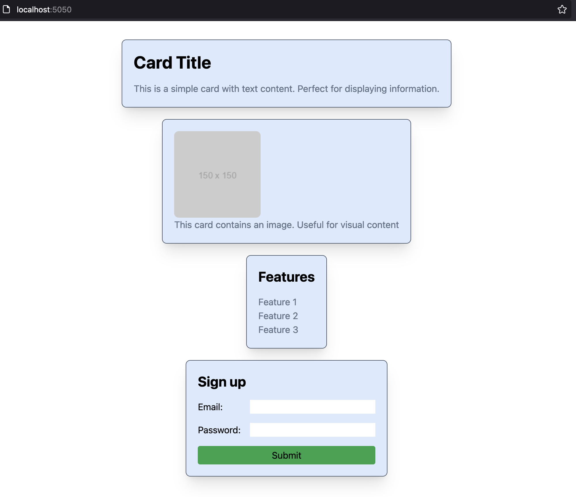
1. Card with simple text content
<Card>
  <h2 className="text-3xl font-bold mb-4">Card Title</h2>
  <p className="text-slate-500">
    This is a simple card with text content. Perfect for displaying information.
  </p>
</Card>
2. Card with an image
<Card>
  <img
    src="https://via.placeholder.com/150"
    alt="Example of props.children containing an image"
    className="max-w-[100%] rounded-lg"
  />
  <p className="text-slate-500">
    This card contains an image. Useful for visual content
  </p>
</Card>
3. Card with a list
<Card>
  <h3 className="text-2xl font-bold mb-4">Features</h3>
  <ul className="text-slate-500">
    <li>Feature 1</li>
    <li>Feature 2</li>
    <li>Feature 3</li>
  </ul>
</Card>
4. Card with a form
<Card>
  <h3 className="text-2xl font-bold mb-4">Sign up</h3>
  <form className="flex flex-col">
    <label className="flex justify-between mb-4">
      Email:
      <input className="ml-4" type="email" name="email" />
    </label>
    <label className="flex justify-between mb-4">
      Password:
      <input className="ml-4" type="password" name="password" />
    </label>
    <button type="submit" className="py-1 bg-green-600 rounded">
      Submit
    </button>
  </form>
</Card>
Why this matters
The simple Card component, together with usage examples, demonstrate that props.children allows for a high degree of flexibility in React components. By using this prop, you can create components that are adaptable to various use cases, making your code more modular and maintainable.
Common styling across all instances
As I mentioned above, one of the most powerful aspects of this pattern is that the Card component carries consistent styling, as you can see from this screenshot where I rendered the above examples one after another:
Combining props.children with Other Props
In React, components aren't limited to just using props.children. You can combine props.children with other 'ordinary' props to create even more customisable components. Let’s enhance our Card component by adding a bgColor prop that allows you to set the background color of the card.
Updating the Card component
Here we modify the Card component to accept an optional bgColor prop.
import React from 'react';

const Card = ({ children, bgColor = 'bg-blue-100' }) => {
  const classname = `p-5 border border-slate-600 rounded-lg shadow-xl mb-5 ${bgColor}`;

  return <div className={classname}>{children}</div>;
};

export default Card;
Note that the default value of bgColor is the same as was defined in the original Card component. If no bgColor is passed as an attribute the component will render exactly as it did previously. But we now have the ability to pass a Tailwind colour string, thereby making our Card customisable, while still accepting different content via props.children
Using the bgColor prop
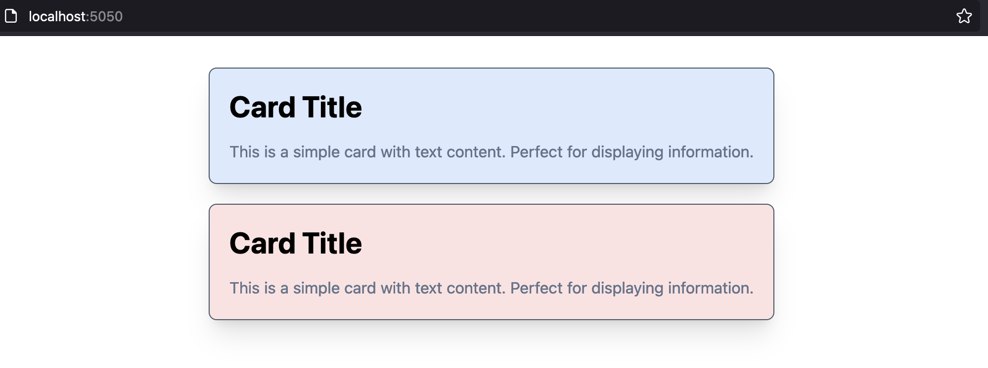
Here is an example of an App.jsx component that renders two Card components
import React from 'react';
import Card from './components/Card/Card';
import './app.css';

const App = () => {
  return (
    <div className="w-screen h-screen flex flex-col jusify-center items-center p-8">
      <Card>
        <h2 className="text-3xl font-bold mb-4">Card Title</h2>
        <p className="text-slate-500">
          This is a simple card with text content. Perfect for displaying
          information.
        </p>
      </Card>

      <Card bgColor="bg-red-100">
        <h2 className="text-3xl font-bold mb-4">Card Title</h2>
        <p className="text-slate-500">
          This is a simple card with text content. Perfect for displaying
          information.
        </p>
      </Card>
    </div>
  );
};

export default App;
Notice that the children element - in other words the jsx wrapped inside each Card component - is the same for each Card. The only difference is that the second Card is passed a bgColor prop.
You can see the result here:
Why use both children and other Props?
Combining props.children with additional props like bgColor makes your components incredibly powerful and versatile. You can design components that not only wrap various content types but also allow for customisation in appearance and behavior.
-
Flexibility:
props.childrenhandles the dynamic content, while other props likebgColormanage aspects of the component's style or behavior. -
Reusability: By keeping your components flexible, you can reuse them across your application with different configurations, reducing the need to create new components for every slight variation.
These aspects are especially useful when dealing with custom component libraries, which brings us back to where we started. Once the junior dev on our team had gained a better understanding of props.children she was able to complete her task using a custom component from our library.
Additional resources
For a deeper dive into props.children and related concepts, you can explore the official React documentation on passing JSX as children.
Additionally, the older but still relevant React docs on Composition vs. Inheritance provide valuable insights into why composition, using patterns like props.children, is often preferred in React development.
Conclusion
Understanding and effectively using the children prop can significantly enhance your ability to build reusable, flexible components in React. By simplifying the concept and practicing with examples like the Card component, you'll be well on your way to mastering this essential React feature.
If you’ve found props.children confusing in the past, I hope this explanation clears things up and helps you see the potential it offers for your projects.